{Roswell Road Trip} Using the Seaside Escape Limitless Kit
Hello, crafting friends! It's Miss Carrie and I'm here with another scrapbook project for you to try. This fun vacation page was created with the new Seaside Escape Limitless Kit. Today, I am going to share how I used elements from this kit to record a memory of our trip through New Mexico.
The Seaside Escape collection is packed full of pattern papers and ephemera from Echo Park, 49 & Market, and Cocoa Vanilla. With so many different elements to choose from, it can be difficult to find a way to create balance on a page. Let me share a few tips with you.
I began with an awesome background from 49 & Market and used those swishes of color to bring focus to the photo. To add to the rustic mixed media look, I removed some pieces of background paper and added a map design. I also added a small amount of mixed media with Natural Cotton Expanding Mousse.
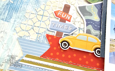
Below my photo, I selected green, red, and blue pattern papers as grounding elements and I brought in a collection of die cuts and stickers to tell the story. To the left of the photo, I added a car sticker from Echo Park and a sign and map from Cocoa Vanilla.
Using the colors from the photo as my guide, I selected two chipboard elements for my title. I also framed my photo with a few leaves to bring a natural element to the page.
The map, sign, title, and photo have blue hues, so I cut an Echo Park sticker in two to place at the top of the page and balanced out the design. I also cut two tags from 49 and Market paper with a die, layered stickers over the top, and added a small chipboard arrow.
I was able to frame my photo using elements from all three collections. The colors play well together, blend beautifully with the background, and they make the photo the focal point of the page.
On the left side of the layout, I added another piece of the torn map. The map pattern added more blue and it has a structured feel like the stripes in the pattern papers below the photo.
Having an element on the left side of the page draws the eye to the focal point. Most people read from left to right, so by placing an item here, where the eyes naturally start, I created a design that draws the eyes to the right side of the page.
To finish off the design, I layered leaves and phrase on the left side of the page in the same colors as the ones around the photo. This creates a cohesive design. If you're curious to see how it all came together, check out a short video on my YouTube channel.
I hope that today's project inspired you. Don't forget to share your layouts and crafty projects with us on Instagram with the following hashtags: #notjustforboyskitclub #njfb #seasideescape (or whatever kit you are using) and on our Facebook group {Not} Just for Boys Kit Club Community. I can't wait to see what you create!


Comments
Post a Comment